Wednesday, March 18, 2009

Toolbox (#2)

What are the changes that I made to the data analysis tool box and why?

In the class, this week my class and I edited our data analysis toolboxes based on our teacher comments and our previous toolbox. I noticed the level of the other toolbox and realized mine needed a lot of work.

The first thing that I changed about my data analysis toolbox is data part of the toolbox. The teacher suggested that I added more detail to this section of the toolbox. I added the names of all the Head Starts that I will be collecting data at. I had to delete the Grand Isle Head Start because there are transportation issues. I will have to call them instead of collecting the data myself. I made to changes to add clarity to this part of the toolbox. It really makes it easy for me know what question I am answering and why I am collecting the data.

One of the major parts that I changed in the data analysis toolbox is the graphs part. I added why each graphs was the best to use, what are they going to be used for, and some I added what they are. For example, “The box plot is used to show the spread of the data and the five number summaries. It would be easy to compare the centers’ performance by comparing the box plots. The box plot would show the minimum, maximum, median, first and third quartile. The box plot would also show the outliers that are in the sample.” This is an important addition to the toolbox because would help me with the comparison. Also, I know exactly why each graph is used.
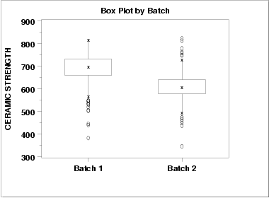
The last thing I changed is the numerical summaries portion of the toolbox. One of the major additions is the two-sample hypothesis t-test. I added that because I need to compare the West bank and East bank. I also choose the t-test because I do not know the population standard deviation. I also added why the other numerical summaries would be used.

Friday, March 6, 2009

"HOT" Blogs

Friday, March 6, 2009

Everybody use blogs everyday to communicate about different topics. I like to use appealing color schemes and speaking in a language that is appropriate to the audience. I enjoyed reading Sobia’s entries because it was like we were having a conversation with one another. My teacher should be looking for when grading our blogs is a conversation like dialogue. We have to be able to relate to the audience and the best way is to use dialogue type writing. It is also important that they keep the audience in mind and use appropriate language to convey their message. Also, the teacher wants us to have pictures that are related to the blogs. I think she should rate the pictures based on the creativity and relevance to the blog entry. Also, we should be graded on using media other than pictures such as videos, screenshots or quotes. It would be awesome if someone created a sound bite and uploaded to their blog. Of course, the sound would have to be relevant to the topic. The teacher should also look for our use of examples. Maybe we could relate our blog entries to an example or experiment that we done before. It would help us with finding research and how to find a relationship between my information and someone else’s. We should find links to websites that relate to our topic or blog entry. The links could better clarify the point or the points we are trying to come across. I enjoy writing blogs not only for this class but for my personal use. It would help if we had guidance for the blog entries for this class. I hope my teacher receive inspiration from my and my classmates blog for our rubric for the blogs for this class.

Friday, February 27, 2009

Data Analysis Toolbox

When someone is creating an experiment, it is important to have a plan of how and why the data are to be collected. The data that were collected is described by four-year-olds that attend Jefferson Parish Head Start. The variables were the grades they make in a test. They were recorded in percentages and percentiles. The test was based on the expectations four-year-old should achieve at their age. I received the expectations from a teacher adviser at one of the centers. They were tested on math including counting and recognizing numbers and English including reciting the alphabets, writing and recognizing their name. The reason the data were collected not only to complete a project for statistic but to find a relationship between East Bank Head Starts and West Bank Head Starts. At the conclusion of the project, I will be able to find out which center is the best in terms of teaching and whether the East Bank or West Bank is better. I was responsible for collecting all the data and I administered all the tests. It was gathered at all the Heat Starts in Jefferson Parish by giving the students a test.

The graphs that were used to help analyze the data were histograms, bar graph, box plot and a two way table. The histograms were used to assess the grades by center. The histograms were able to show the normality and the cluster of the data for the centers by the percentages. The box plots were used to show the spread of the data; it showed the lowest score, the highest score, middle score, and the quartiles. The bar graph and the two way table were used to compare the centers. The bar graph showed the amount of students who received a passing grade (seventy percent or higher). The two way table would share the same purpose of the bar graph but they would show percentages instead of counts.

Friday, February 20, 2009

Experimental Design

Question: Does the level of education for Jefferson four-year-olds vary from the different Head Starts?

Objective: To determine if the levels of four-year-olds vary among the different Head Starts.

Hypothesis: The education level of the Head Starts students aged four should not vary at the different locations.

Materials:

  • 30 four-year-olds from each center
  • Expectations lists
  • Empty room or room with limited distractions

Subjects:

The students are chosen by a simple random sample from the school’s roster. The parents would be asked to sign a waiver asking if their children could be assessed.

Procedure:

  1. Collect the students using a simple random sample from the school’s roster
  2. One student at a time would be brought to a room with little distractions
  3. The students would be assessed
    1. Math

i. Counting to 20

ii. Recognizing the numbers up to 10

    1. Language Arts

i. Saying their alphabets

ii. Recognizing their name

iii. Recognizing letters

  1. The students’ answers would be rated right, wrong or admitted and they would receive a grade based on their performance.
  2. The data would be analyzed according to the data analysis tool box

Thursday, February 19, 2009

Project Topic


Thursday February 19, 2009

In statistics class, we have to come up with a topic that effect New Orleanians and we can analyze the data. I decided to focus on the Head Starts that are located in Jefferson Parish and Orleans Parish. My research question is how the levels of the four-year-olds compare at the different Head Starts and the different Parishes? I decided to choose that question because my mom is a Head Start Teacher Advisor, and she was wondering if the levels of the children at the different Head Starts differ. I think it would be interesting to find a correlation between the students’ level and the schools’ location and the schools’ attendance. It would fascinating to find out if Jefferson Parish students have a higher level before they start school compared to Orleans Parish. Also, knowing which Head Start is the best to send a child would be an interesting fact.